The story behind the Be Different Studio logo
(Aka: how a few lines and shapes carry a whole world of meaning)
Before Be Different Studios even existed, I already knew what the logo would be.
Not because I had a slick brand strategy but because the image had already formed somewhere in me. I could see it on the edge of my awareness like a shadow following me. I couldn’t explain it clearly but I knew I had to trust it. So I played around on Canva and started pulling ideas together, trying different shapes and ideas but kept coming back to the same two things. Mountains and water.
Finally I felt I had it and it was simple:
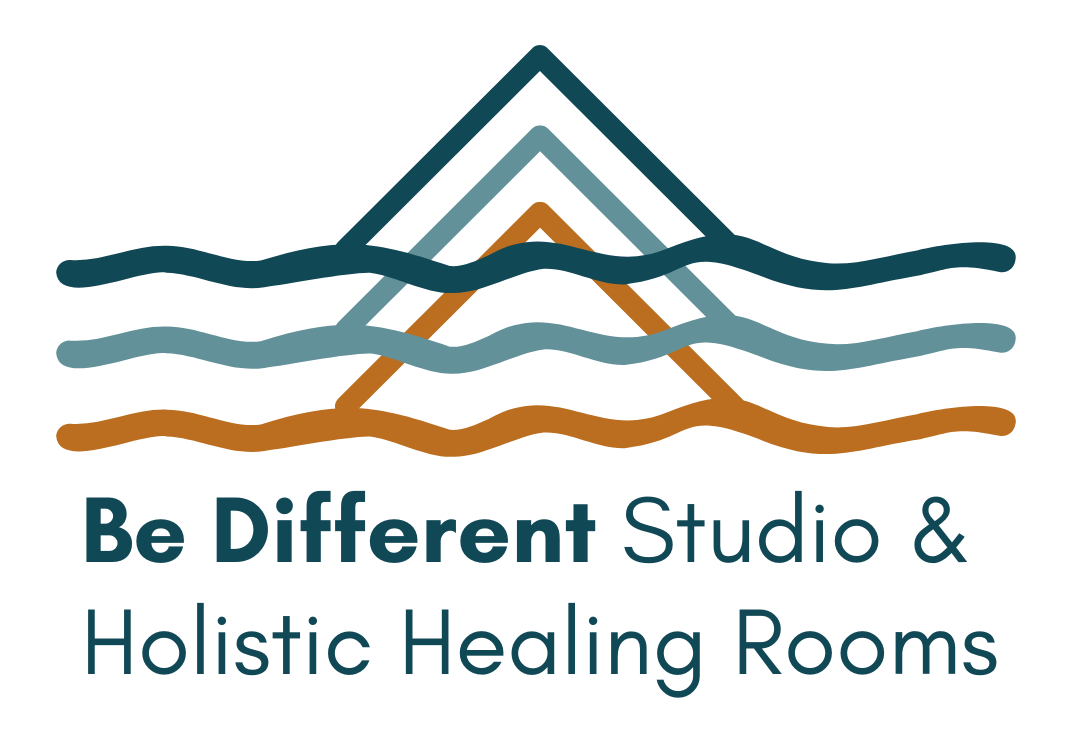
Three mountains.
Three flowing water lines.
Overlapping.
The original logo design
But what those six shapes carry… is everything.
The three mountain peaks speak to challenge and growth, the hard-earned kind. The kind that rises up through layers. That reshapes you. That asks something of you. Like the hard times in my own life where I have had to start again, rebuild and build a whole new life. I remember what it was like standing at the bottom of the mountain looking up, it was daunting but I knew there wasn’t really another option.
They also represent the three countries that have shaped me:
New Zealand, the place I live now and was a mythical place in my childhood.
Australia, one of the places I started again and grew so much.
England, the place I was born and grew up.
Each mountain in the logo has its own colour, teal, orange, and dark blue, to reflect those lands. And with them, the different versions of me that have emerged from each place.
Then there’s the water.
Three lines, flowing below the peaks.
At first glance, you might just see waves. But they hold deeper meaning.
They speak to what lies beneath the surface. This is a key part of my work with both individuals and groups.
In group facilitation (inspired by Lewis Deep Democracy), we talk about going under the waterline and listening not just to what’s being said, but to what’s not yet spoken.
The things that ripple below the surface.
The emotional undertow.
The unprocessed truth.
What is behind the words.
The three layers of water also reflect pattern recognition, a core piece of Warm Data work and one of the greatest opportunities I see to change the world..
Seeing the pattern in yourself.
The pattern in the group.
The pattern in the wider system.
We don’t just grow in a vacuum, what we change in ourselves ripples out.
We repeat lessons.
We cycle through themes.
Until something shifts.
There’s also polarity held in this image
Water and a mountain.
The feminine and the masculine.
Flow and form.
Surrender and strength.
Even that single point at the top - the peak that rises out - holds meaning for me.
It’s a nod to the parts of us that have been marked, the things that have left their scars.
The way trauma or experience shows up, just above the surface.
Not always visible, but there.
And part of the work is naming it. Meeting it. Letting it move.
So yes, it’s a logo.
But it’s also a signal to my worldview and approach to my work.
One that says:
- We all carry layers.
- We all repeat patterns until we don’t.
- And when we dare to go deeper, we emerge different.
My company Be Different and Be Different Studio & Holistic Healing Rooms was born from that idea, that healing, growth, and leadership aren’t surface-level.
They live in the deep.
And that’s where we do the work.